
I graduated from the Maryland Institute College of Art in 2011, with a BFA in Illustration and a minor in animation. Since then I've worked on several illustration and animation projects, but spend most of my time traveling around the country building rock climbing walls for Nicros Climbing Wall Systems.

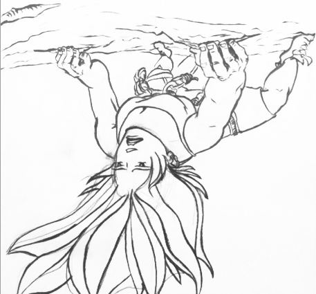
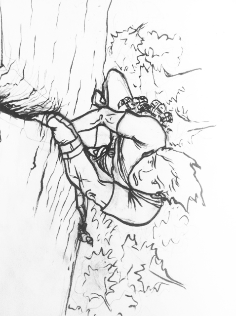
For this cover we wanted to do something different, but yet still capture the aesthetic of Adirondack Rock as a guidebook, art book, and historical narrative. Being two volumes, we also needed something that grouped them together. We discussed many ideas and decided that illustrated covers would be a complete departure from the norm. Using a photograph on the slipcase keeps the book consistent with guidebooks norms, but the moment the books are exposed, you realize that these books are different. We believe these covers are intriguing and may encourage future guidebook authors to try something new.

My favorite medium is brush and ink, and in a style I hope to use in future graphic novels. (A graphic novel is a collection of drawings in panels that tell stories for mature readers). I inked the drawings and scanned them, then applied colors in Photoshop, a technique used in many graphic novels. Coming from a background of graphic novel illustration, the covers can be read as a mini-story, with the woman climbing the first pitch, then the man climbing the second pitch with the woman belaying in the background.
I spent a lot of time giving the illustrations an Adirondack feel—drawing and erasing lichen pieces, adjusting trees and rocks, hanging moss over boulders, and changing colors to clarify the images. Getting the correct body positioning for the characters was a time consuming effort that involved many sketches. It was a fun project and I was grateful for the opportunity to work with the authors.